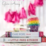
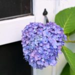
Last week I did this little branding exercise. Inspired by House of Brinson’s Styling class I wanted to figure out the colour palette I was subconsciously using in my photographs. I had consciously decided on my actual blog colours (logo, titles, text, sidebar, social media), but I had not paid specific attention to my photo colour palette.
So, this little exercise was taking it a bit further – stepping back and looking at my work for the past 11 months. And this is what I saw – a colour palette of neutrals, blues, some dark purples and occasional pops of green, pink and yellow. There is a theme going on! Also note that I had no purple until I did an upcoming holiday shoot, which will go live in December and then I used purple for a recipe that’s going live on Monday, so this is a little sneak peek for you.
Sometimes it’s worth the time to go back and look at your work as a whole – making sure that things are cohesive, well branded and tell a story. Have you looked at your work recently?
Some specials I want to share with you this week:
- Talking about colours.
- Aran and Sarah make Cranberry and Quinoa Scones
- Purchase Make Your Day – the craft ebook. Some lovely ideas there.
- Spinach and Egg on small pizzas? yes please!
- Personalized wrapping paper? Awesome!
- Herb and Fruit Pairings


