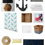
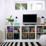
 I’ve been sitting on this big reveal for months now – impatiently waiting to share this great space with you. I’ve been working on this room with the Land of Nod since late summer. I’ve been contributing to the Land of Nod blog for over a year now, and luckily I had a chance to have them help me transform our how-hum multipurpose room into a comfy and welcoming space we can use every day.
My favourite thing about the Land of Nod brand? I love how their products are appealing to kids, but can fit into an adult space. They offer high-quality home decor items that I’d want even if I wasn’t furnishing a playroom. And how appealing their things are is evident in how we used their items in our playroom/office/guest room. It’s a space we play in, a space we work in and a space we have people stay when they visit. Everything works well together, it’s efficient and no longer looks cobbled together.
So, let’s take a tour together – our playroom/office and sometimes guestroom is on the main floor, a couple of steps below our kitchen and living/dining room. This room is a challenge in many ways, as it not only serves multiple purposes, but also has the door to the basement and connects to the mudroom. Tackling the odd layout (3 doorways, 1 window, 9 corners) was our first challenge – after that, Danielle Kurtz, the awesome Creative Director at Land of Nod created a shared Pinterest board where we could share our ideas and decide on a design direction.
 I wanted to ensure that the room connected visually to the mudroom that was visible through a large open doorway, but we also wanted to add some interest to a 14 foot long wall that you see right when you enter the room. We decided to make it the focal wall and to create different zones throughout the space. After pinning many things we liked, we saw a theme. ‘Woodland Inspired Menswear’ is the direction we were going…something playful, but masculine – a mix of patterns and textures with some tongue in cheek references to woodland animals. Neutrals and pops of colour here and there – just like you’d add a fun tie or a checked shirt.
 We looked at different wallpapers for the feature wall and considered a hounds-tooth pattern and a buffalo check, but I was drawn to different versions of herringbone. I couldn’t find wallpaper that matched my colours or scale, but I did find a stencil. So that’s what I did – I stenciled and stenciled and stenciled some more. Albeit far from perfect, I love the end result, but truth be told, it was tedious and painful and I would not do it again. My stenciling days are over! (I also have to do some touch ups on less than perfect edges, but I’ll get to that later this year)
In addition to the feature wall, we also created a double desk area, put in place a shelf and a book trolley next to the sleeper couch, added an area rug, a coffee table, extra seating, a large storage unit and tons of baskets and bins to store our toys, craft items and office supplies.
A fun light added whimsy to the space and serves as a perfect reading light. Adding a low hung mirror above the dress-up basket encourages play. The acrylic book trolley helps the space not go too country, is light and airy and references the acrylic office chairs. It’s also the perfect space to keep all of my husband’s old children’s books.
Three large scale vintage style Swiss travel posters have a big impact on some big expanses of wall and connect different areas of the room, while maintaining some of the blue colour palette. Adding a picture ledge above the desk allows for a fun rotating gallery and display of small items.

 Once the wall was stenciled, the walls were painted and the rug placed, I turned to my friends at Tonic Living for fabric. I wanted the menswear inspired patterns and textures, but I also wanted that take on the woodland theme we were looking for. We opted for a dark grey pinstripe fabric for the window panels to give some weight to that wall and connect it to the darker colour on the feature wall. More grey and a obvious woodsy feel was brought in with the willow pillow. We introduced the light blue colour and referenced the wall pattern by adding the spice market pillow. Small lumbar pillows in a red Herringbone were added to the office chairs and two covers for the existing sofa bed pillows were made with a neutral buffalo check fabric. I also added the fun racoon pillow and bow throw pillow from the Land of Nod.

 We made two mall changes to the mudroom. We replaced the window treatment with a faux roman blind made from the same red herringbone fabric as the pillows. The texture, pattern and colour of the fabric work well with the new large Zurich poster, but also connect the room to the playroom/office.
We also sprinkled bits of red throughout the room to connect to the red bench in the mudroom. Examples are art on the picture ledge, lumbar pillows, buckets and baskets and the small mirror. While the main colours are grey, white and shades of blue – adding pops of red, yellow and green make the space less contrived and more manageable.
Until we finish the basement (next project on the list!), we decided to keep our existing sleeper sofa. Once our guests can move to a separate space, I will upgrade to the twin sleeper in a darker shade of grey. The smaller scale will work better in the room and the darker grey will ground everything a bit more. I also decided to use my vintage low chinese coffee table – I like the size and height and the dark work wood tone brings some warmth to the space and plays well off the acrylic and metal elements in the room.
Whew – I think this is the longest post I’ve ever written! This was such a fun project – so much work went into this and I can’t thank Land of Nod and Tonic Living enough for working with me on making this space a great place for everyone. I hope you are inspired to tackle that odd space, that forgotten corner.
Get the Look:
- Rug
- Pouff
- Grid Nightstand
- Acrylic Bookcart
- Striped Cube Bins
- Wire Storage Bin
- Racoon Pillow
- Bow Pillow
- Little Desk Drawers
- Bunny Lamp
- Curtain Panels, Faux Roman Blind, lumbar pillows, pillow covers and two pillows from Tonic Living.
- Stencil from Royal Design Studio
Wall colours:
- Grey walls: Thunder by Benjamin Moore
- Blue in mudroom and on feature wall: Blue Echo by Benjamin Moore
- Light blue on feature wall: Sunken Pool by Martha Stewart
- Dark brown on feature wall: Willow by Benjamin Moore
Disclaimer: Items were in part provided by Land of Nod and Tonic Living. All opinions are my own.

